Improving a nonprofit's service process
We partnered with The Healing, whose mission is to normalize the narrative around healing as Black men, to reorganize their business and service structure. Let's dive into the creative process.
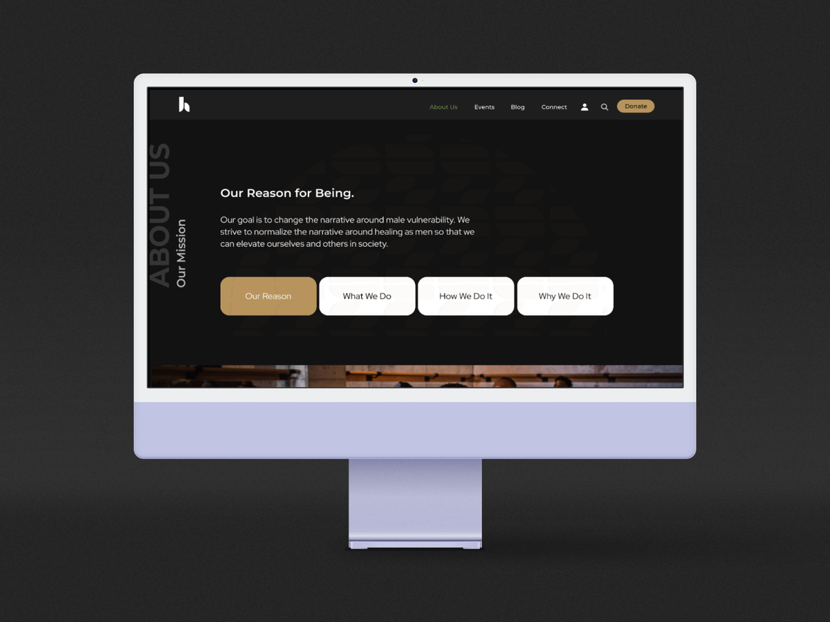
With the rise in self-help articles and therapeutic solutions, on-demand support apps, and wellness coaching – more and more services now help individuals keep on with all the faces of supporting their mental health. This increase in services means it's essential for UX designers to work on various interfaces of this kind.
Here, we'll look at a case study reflecting that; we partnered with The Healing, whose mission is to normalize the narrative around healing as Black men, to reorganize their business and service structure. Let's dive into the creative process.
Our goal was to introduce ways members of The Healing could benefit from the site.
The team and my role
Worked with an in-house UX designer during the sprint and an additional design team of 4. My role was project manager and researcher focused on the following key areas:
- Creating end-to-end UX & UI implementation of concepts and ideas
- Developing and maintaining the organization of project materials
- Creating components for high-fidelity animated prototypes
- Communicating closely with stakeholders during the implementation
Defining key pain points
The Healing wanted to step aside from the traditional nonprofit model where websites offer a quick tidbit about the mission, quick links for donating, and limited interactive UI. And journey toward a site that reflected the mission as much as it projected. A website where healing takes place and donors donate.
Before designing anything, we collected and distilled down the specific key points and challenge areas, prioritizing the needs we could focus on during the three weeks sprint:
- The backend process is tedious
- Users interact via social media
- Lack of content management
- No strategy for offering services to younger audiences
- No present digital community
The process
We spoke to general BIPOC men and members of The Healing via user interviews and a survey to better understand their needs and desires. We were interested in learning the following:
- Are users learning about mental health digitally?
- What gets in the way of healing?
- Is communal healing effective?
- What are users best learning practices?
- Ways to digitally engage current users?
Takeaways
- Currently, users are not using digital tools to learn more about mental health
- Time and motivation prove to be the biggest challenges for working on wellness
- Being in the community will not take away from healing practices
- Our users prefer learning through hands-on experiences
Problem-solving
Restructuring The Healing to be website centric seems plausible as our target audience does not have a home base. With time and motivation being the most significant challenges, we should prioritize shorter content on the site and develop a like-minded content strategy. Since our users prefer hands-on experiences, our site should reflect a hands-on level of engagement. To accomplish this, we need the following:
- To offer software that doesn't break the bank
- To build out top-level branding guidelines
- To create a blueprint for an end-to-end process
- To decrease the number of steps it takes to sign up for an event
- To offer additional ways to engage as a community
How did we go about this?
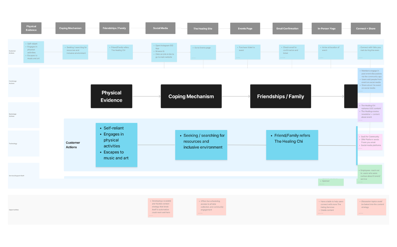
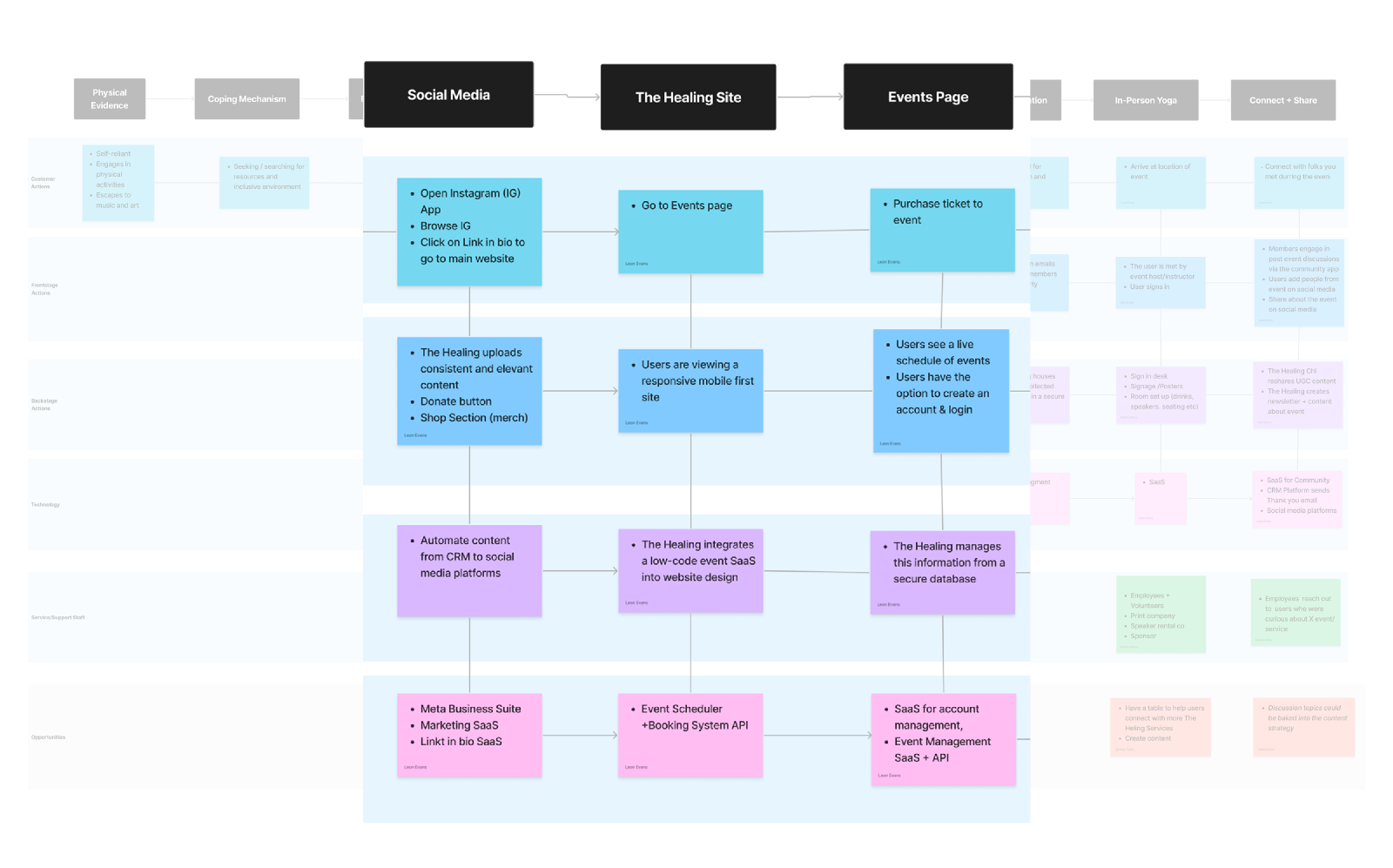
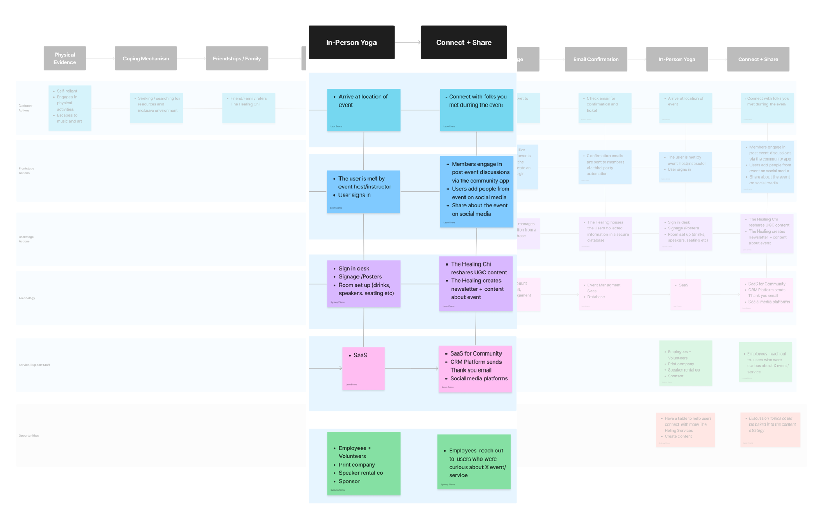
Service Blueprint. A vital intersection and catalyst to the connection that is target users and what The Healing offers are the community. Added additional support on the backend with marketing and event scheduling software. In-person support for renting and managing sound equipment and employees and volunteers.
Quality software that gets the job done comes at a price. And the cost can sometimes limit scalability, so with that in mind, we went back to the drawing board and developed a list of software that met stakeholder expectations and have free access for nonprofits. The complete list allows our partner at The Healing to have multiple options for stakeholders and works to decrease decision-making time.
Descriptions below are the minimum features for each category
- Marketing - email campaign, newsletters, metrics
- Community - discussion boards, threaded conversation, mobile friendly
- Website - events, live scheduling
- CRM - security, automation, data ownership
- Bonus - free services the company could benefit from

Personalization of websites is pivotal for the user experience. Gone are the days of offering a product or service to solve a specific problem. Users prefer a well-tuned experience that correlates to their needs. How might we design a website with functionality like practicing yoga? Well,
- The site would need a calming introduction
- Clear, repeatable steps
- A process that gets better over time
- Offers the user more than it takes
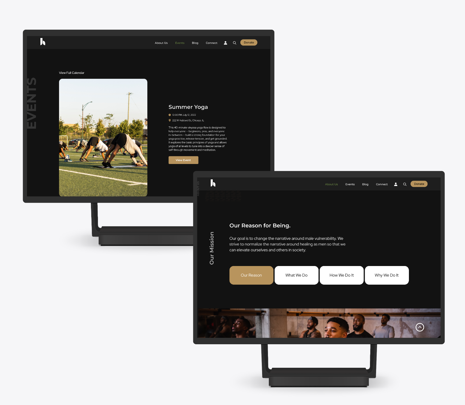
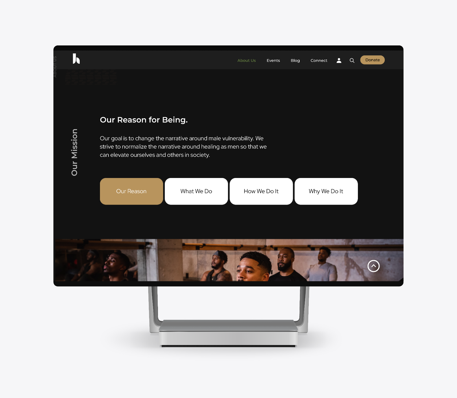
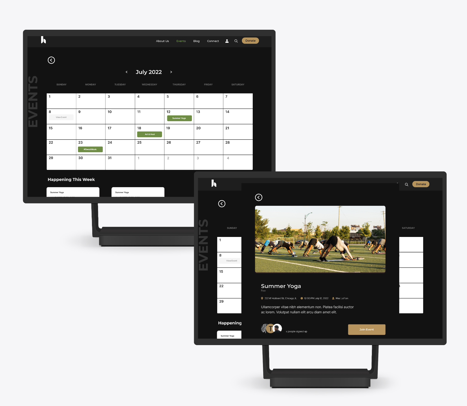
Final mockups

Impact generated
We conducted two rounds of usability tests. After eight participants, we were excited to see the following feedback both from our metrics and from our users as well:
- Ease of navigation increased by 7%
- Number of users able to discover events equaled 71%
Comments such as:
- “So smooth, I’d come back for that alone.”
- “Seems like a good way to find and register for events..”
Comments ()